Category Archives: Health

Aceso Interactive Sphere – A Review

There’s a monitor hanging in my room instead of the usual TV. It can function as a TV, of course, but it does a whole lot more. Some of it well, some of it not so well. The most important feature, in my view, is that it also displays patient information: information that the patient needs to see, as well as information that nurses and PCAs need to see when working with the patient on a day-to-day basis. This feature is intended to replace the whiteboard that is still, for now, also hanging in my room. Here, I want to focus on the patient information piece. We’ll start by considering the “As-Was” of the Patient Whiteboard, then consider the “As-Is” of the Patient Information Screen.

Patient Whiteboard

The whiteboard has the following sections and subsections. Refer to the image below for how these sections are laid out.

  • Static Information
    • Room #
    • Room Phone #
  • Patient Name. An entry field for patient’s name. In my case, the name that I prefer to be called by has been  written in.
  • CARE TEAM. A series of fixed positions in the care team allowing for actual names to be entered.
    • MD (doctor)
    • RN (nurse)
    • CM (case manager)
    • OT (Occupational Therapist)
    • PT (Physical Therapist)
    • SLP (Speech Language Therapist)
    • TR (?)
    • <blank>
  • MOBILITY. Three fixed mobility types, allowing for specifics to be entered.
    • Bed Mobility
    • Bed to Chair Transfer
    • Ambulation or Wheelchair
  • DIET/SWALLOWING/COMMUNICATION. Three fixed fields, allowing for specifics to be entered.
    • Diet
    • Swallowing
    • Communication
  • ADL.  Assisted Daily Living. Three fixed fields, allowing for specifics to be entered.
    • Toilet Transfer
    • Bathing
    • Dressing
  • SAFETY. Three fixed fields allowing for specifics to be entered,
    • Safety e.g., Fall Risk
    • Precautions
    • Equipment
  • OTHER.
  • DAILY SCHEDULE / DATE

In my case, most of these fields have not been entered, and even if entered, they have not been updated. In particular, someone has entered an MRN (Medical Record Number) in the OTHER section, but’ it’s not mine. I can only assume that it’s left over from a previous occupant. Also, in the DAILY SCHEDULE field, the dietician wrote in the phone number for the kitchen,

Patient Information Screen

The monitor appears to have a 16×9 display, I measured it from my bed using my iPhone Measure app, and got a dimension of 43” wide and 23” high which actually makes it a couple of inches wider than you’d expect with that ratio. The screen has the following sections and subsections. Refer to the image below for how these sections are laid out.

TV and Generic Information

This section occupies the top left corner of the monitor screen, with dimensions 30.5” by 17”. Accounting for measurement errors, this is consistent with a 16 by 9 ratio for broadcast TV. The section accounts for approximately 50% of screen real estate. When not displaying TV there is static picture of patients on modified bikes, overlaid with the following sections. Clicking each section yields available options.

  • tv & Movies
  • my Health
  • my Meals
  • my Care
  • my Comfort

Patient Interface

The remainder of the display is further broken down into sections with information specific to the patient.

  • Static Information
    • Patient Name
    • Location (Spaulding)
    • Room #
    • Room Phone #
    • Today’s date and time
    • Est. Discharge Date.
  • Care Team. A partial list of the people and their  positions in my care team. The doctor assigned to the care team is unlikely to change over the course of the patient’s time at Spaulding, similarly, the person assigned as Case Manager is also unlikely to change. Other positions, however, change multiple times a day – usually three times a day corresponding to shift changes. The dynamic positions are identified by first name, initial, position identifier. The only dynamic positions that I’ve seen are RN and PCA. They are very helpful to me as I can greet them by name, and it also helps me remember if I’ve met them before. This window has two subheadings:
    • Care Team Includes: There is space for three positions, one of which is assigned to the doctor. The remaining two list the PCA and RN
    • Case Manager: Space for one name
  • Today’s/Tomorrow’s Appointments. Usually labeled Today’s Appointments, but at 6 pm each day, it switches to Tomorrow’s Appointments. This is a schedule of PT and OT appointments. For each appointment, there are two rows. There is only space for two appointments, although on most days I have three. The space limitation is addressed by the window scrolling every few seconds to show the rest of the list. At 6 pm each day, it switches to Tomorrow’s Appointments.
    • Time, Therapy Type (example: 2:00 PM – 3:00 PM, PT)
    • Therapist.  Name, as first name, last initial. There’s only space for one name, although some appointments may have two if a student or a new therapist is being mentored.
  • My Diet Specifics of the patient’s diet, using the IDDSI (International Dysphagia Diet Standardization Initiative) levels to specify drink thickness and food textures.
    • Diet: example: Dysphagia
    • Solids: example: Regular (IDDSI 7R)
    • Liquids: example: Thin (IDDSI 0)
  • Safe Swallowing: Only applies to patients who have problems swallowing. In my case this entire section is blank.
  • Mobility/ADL (Assisted Daily Living). This window has multiple entries. It’s not clear if they are fixed sections or dynamic; I suspect fixed. The sections on my display are:
    • Bed mobility: Describes ability and precautions for transfers from bed to walker and wheelchair.
    • Toilet Transfer: Describes ability and precautions for accessing the toilet.
    • Bathing/Dressing: Describes ability and precautions
    • Safety: Blank in my case
    • Precautions: Overall precautions. In my case it refers to the ROMAT (Range of Motion as Tolerated) of my left and right legs.
    • Equipment: Blank in my case

As-Was versus As-Is

Most of the sections are the same in the Patient Whiteboard and the Patient Information Screen. The advantage of the screen is that it is more easily and consistently updated.

In particular, the Mobility/ADL section allows for more detail that it is important for the changes in nursing and PCA staffing to view. In my case, the section has a little pink leaf icon (at least I think it’s a leaf, but a pink leaf makes no sense) in the top right corner. I asked one of my PCAs what it meant. He laughed and said, “no one knows!” I asked Sara, an OT though, and she said it meant “Fall Risk” and that 95% of patients had it on their displays. The reasoning for the leaf icon is quite a stretch. It’s using the homonym “Fall,” as in the season (leaf → fall, geddit?) to alert the staff that the patient is a Fall risk.

One advantage of the old whiteboard is that it allows for on-the-spot corrections and additions by the staff if they see an error or omission. In practice, however, they rarely make corrections. The whiteboard is not used much, and it’s hung in an awkward place for nurses to access, to the side of the bed. Another minor advantage of the whiteboard is that it can display additional information that the screen is not set up for. In my case, a nurse wrote in my preferred name and the phone number of the kitchen. There are, however, some disadvantages. There’s no automated checking that the information is correct. There’s information on mine that’s out of date. Also, someone had written an MRN (Medical Record Number) on it that is not mine. Presumably it was for a previous occupant.

Possible Improvements

The Patient Information Screen has several areas that could be improved. What seems like an odd quirk at first is actually a necessary design feature, namely that the ON/OFF button on the patient controller does not actually turn off the display. It just turns off the top left 50%, devoted to TV and Generic Information. The other 50% of the display has important information, so it’s always on and cannot be turned off, except by unplugging it. The section does dim in the evening, but it’s distracting when you’re trying to sleep.

My overriding concern is that the design is trying to jam two things together that are very dissimilar. The TV and Generic Information display is the same for all patients and can be turned off and on. We can design for the use of real estate because we know that the size of each block will not change, and it’s not a safety issue if it’s turned off. Conversely, for the Patient Interface, designing for the use of real estate calls for dynamically resizing windows. This is because the types and amount of information will be different for each patient, and subject to change multiple times a day. In the As-Is design, however, the patient information windows are relegated to fixed sized windows clustered around the bottom and right edges of the screen.

For example, the Today’s Appointments window is probably the most important information for a patient, but it occupies a mere 5% of the overall screen and is not large enough to fit all the relevant information. The kludgy design implemented to overcome this limitation is to cycle the screen to show different sections of the overall schedule. It would also be nice to see what tomorrow’s schedule is, but I have to wait until 6 pm to see this. The information in this section ought to be, but apparently isn’t, synchronized with PT and OT visits in the Epic Patient Gateway.

The second most important window to me is the Care Team window. Two of the roles listed here (Doctor and Case Manager) will probably not change over the course of a patient stay, whereas the other roles (RN and PCA) will change several times a day. It’s helpful for the patient  to get to know the staff that they interact with on a frequent basis. And yet, this window is also relegated to a mere 5% of the overall screen. Moreover, since two of the positions are static information, they might be better placed with the other Static Information window, positioned in the lower left corner.

Over on the right side of the screen, the My Diet windows appear to have a blank row. It’s not clear why it needs to be there. Also, in my case, the entire Safe Swallowing window is blank. If it were to swap places with the Today’s Appointments window, you’d be able to get at least three appointments listed. The Mobility/ADL window, being space constrained, has a bunch of acronyms. In my case, I counted 16 of them. The use of acronyms may be all well and good for the trained staff who are the primary users of this information, but let’s not forget that the patient is also an important participant in their own recovery, and they should also be able to understand and act on the information; this is made much harder by the reliance on acronyms.

Solution Options

I’m coming to the end of my two week stay here, so I’ve had plenty of time to think about how to address my major concern that the patient interface needs major improvements. Any solution will need to address the fact that there’s simply not enough screen real estate, and what space there is in the current design is limited by not being able to use dynamic window sizing. So here are three possible solutions to lack of space.

  1. Ditch the attempt to combine two incompatible information displays on one screen, and use two different displays. These could be hung stacked, side by side, or totally separated. That way you open up more possibilities for the design of the patient interface, with static windows when the information is static, and dynamic windows when the information is dynamic.
  2. Hang a single screen in portrait mode and divide into two regions. One region could be TV in 16:9 aspect ratio with generic options below. The second region would be a rectangular space for patient information.
  3. Keep the current layout, but provide a patient option to resize the area devoted to TV and Generic Information. Patients would have the option to make this area LARGE (the As-Is size), MEDIUM, or SMALL. When set to these last two options, the Patient Interface section would resize the dynamic information windows, especially the Care Team and Today’s/Tomorrow’s Appointments windows.

A Step in the Dark

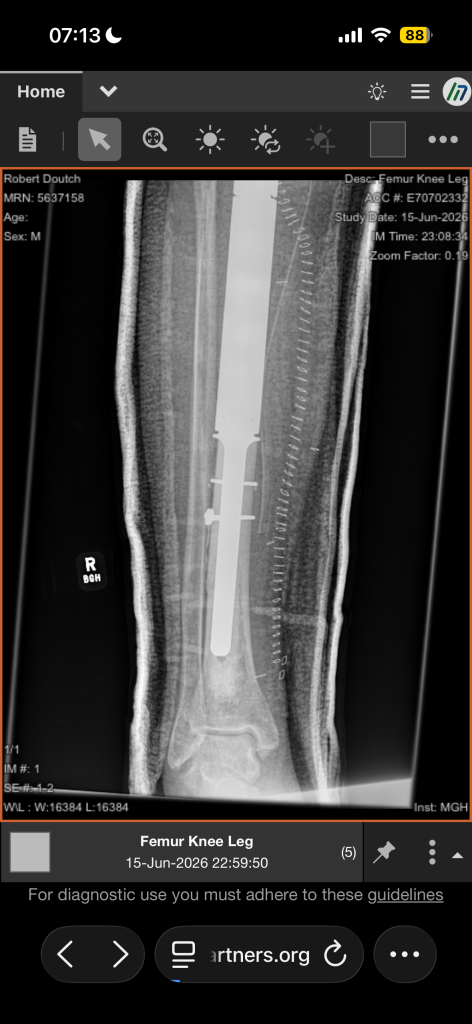
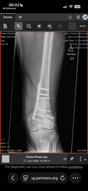
My hopes of recuperating at home for a few more days were dashed last week when I had to make an outpatient visit to the Emerson lab for a routine blood draw. I was transferring from the car to a wheelchair and pivoting on my good left leg when I heard a crack and felt intense pain. I fainted for a brief moment. The world turned bright white! From having only one good leg I was left with none. The health lab declined to do the blood draw and called a doctor to check me out. It was obvious by now that I would not be going home and would need to be admitted to Emergency. Rather than wheel me there they ordered an ambulance to take me the 100 yards up the road. Must be the shortest ambulance ride ever, but I’m sure that’ll make no difference as to how much I’m billed! I spent a couple of nights at Emerson before being discharged back to MGH. I had surgery on my left leg three days ago and now have a titanium alloy rod taking up most of the internal portion of my left femur, plus a few #14 screws to attach it to the bone. PT was here yesterday and I’m healing well. The story doesn’t end there, however, because I have also been diagnosed with osteosarcoma. While it has not metastasized and the surgeon removed all the infected bone, I’m still facing several months of chemotherapy. Oh well, I still have a lot of books to read, music to listen to, and time to work on my blog at https://onedarnthing.blog/  Feel free to browse.

One Step Beyond!

It’s now 52 days since I broke my tibia and began my medical journey. Numerous doctors, surgeons, hospital staff, rehab staff, my friends, you, my correspondents, my daughter Miranda, and above all, my wife Maureen, have kept me from descending into madness, for which I am sincerely thankful. I was discharged from MGH today and am writing this from home. I was previously discharged to rehab, but it turned out that somewhere along the line I’d picked up a nasty variant of e-coli. That meant sending me back to MGH for diagnosis and selection of the right antibiotic: Bactrim.  My right leg is in a rigid brace that prevents it from bending; I’ll have it on for several more weeks. And hey, although I’ll admit to being a fair-weather fan, with both US and England still in the World Cup, it’s not the worst thing to have some spare time.

On MGH and Vuvuzelas

MGH appears well run, which is not to say that there are times when I have been dissatisfied. Above all, of course, is the need to ensure safety of the patients and freedom from obstacles to that purpose. The parts of the organization that I come into direct contact with are the nursing staff, the facilities in the ward, and the people that maintain those facilities. There are also the doctoring teams, and at the top, the superstar specialists and surgeons. In some ways, running a hospital must be like managing a sports team, a rock star, or an airline. They all have a clientele that is willing to repeatedly spend a lot of money to receive their services, and they must maintain their reputation for excellence. It costs a lot of money to maintain these services and reputation. The bottom line, however, must be that safety is essential, while the budget for safety and the financial benefit is impossible to measure. Back to the nursing team then, I am somewhat surprised that, unlike most major hospitals in the Boston area, MGH does not have a nurse’s union and it appears that management actively discourages it. An entry in Wikipedia reads as follows:

The vast majority of MGH’s thousands of registered nurses are not represented by a union. While sister hospitals in the Mass General Brigham (MGB) systems […] have nurses represented by the Massachusetts Nursing Authority, MGH nurses have historically voted against unionization.”

The entry goes on to notes that 88% of physicians voted in 2025 to unionize, but that Nurse Practitioner and Physicians Assistants are predominantly non-unionized. Reading some additional  articles it seems that the board fears reputational loss, which in turn lessens the ability to attract top-rated staff, and overall loss of management control – both of which I understand. What I do miss, however, is the apparent lack of specialized training and a reliance on on-the-job training. This latter method, although essential part of training, carries the risk of instilling sub-optimal practices simply because they are easier to use. It also encourages the acceptance of work-arounds leaving the obstacles in place. For example, the nurses frequently complain about the new suction pumps used with the Jackson-Pratt bulb drains that pull liquids from the site of the surgery. In my case, I have two bulbs and sets of tubing that work with a single suction pump. The new pumps apparently have more features than the old pumps, but they set off alarms multiple times a day. The alarm is particularly discordant, and seems to have based on the sound made by a vuvuzela. This is obviously an annoyance to the patient, but it is also a distraction to the nurses who may be engaged in other tasks requiring their concentration.

It seems that the pumps were introduced using a train-the-trainer. Nurses also do not have any channels for expressing their frustration with the device. I was also disappointed when I mentioned the applicability of safety management systems in healthcare to Nick, my nurse for the day. He had never heard of the work of Jim Reason in this area. This was a change from my experience as a cancer patient at Brighham and Women’s 20 years ago. There, the physician team and nursing team did know about him, and his work developing the famous swiss-cheese model. Pushing further, I asked him if he had read anything by fellow Bostonian, Atul Gawande. Nick just asked if he was born here? (He wasn’t. He was born in Brooklyn, NY). Bottom line, I think that I would like nurses to recognize their calling and the role that they play in healthcare. As I’ve said many times since I’ve been here, I’d like the person asking about “where does it hurt?” and “what’s my pain level?” to actually have experienced pain themselves.

I’ve been reading up on my surgeon, Santiago Lozano-Calderon. SLC as I’ve referred to him here, or ‘Santy’ as members of his team call him. I see that the orthopaedic oncology area in which he works incudes the evaluation and treatment of primary benign and malignant tumors of bone and soft tissue, as well as metastatic bone disease. It’s an area where we don’t have all the answers and difficult to make precise diagnoses. It is eminently reasonable, that six weeks after my first appointment with him, I still don’t have a diagnosis.
Second Step
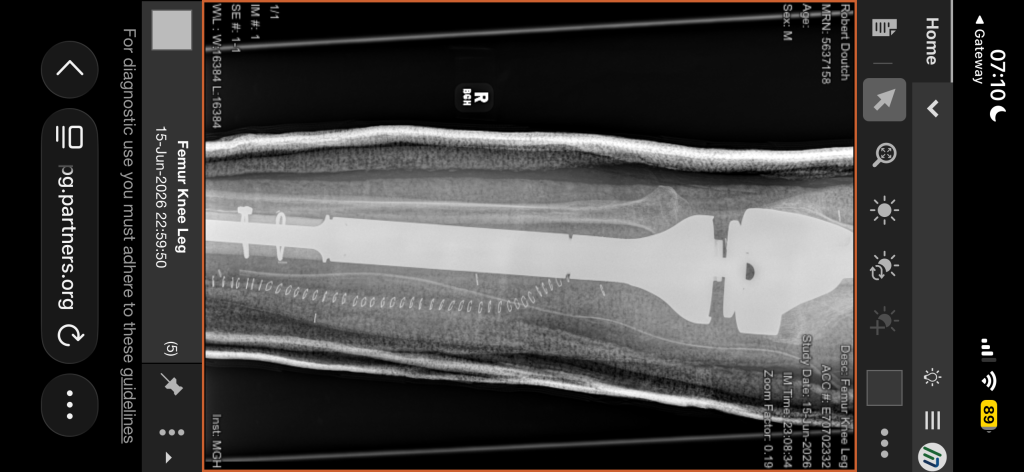
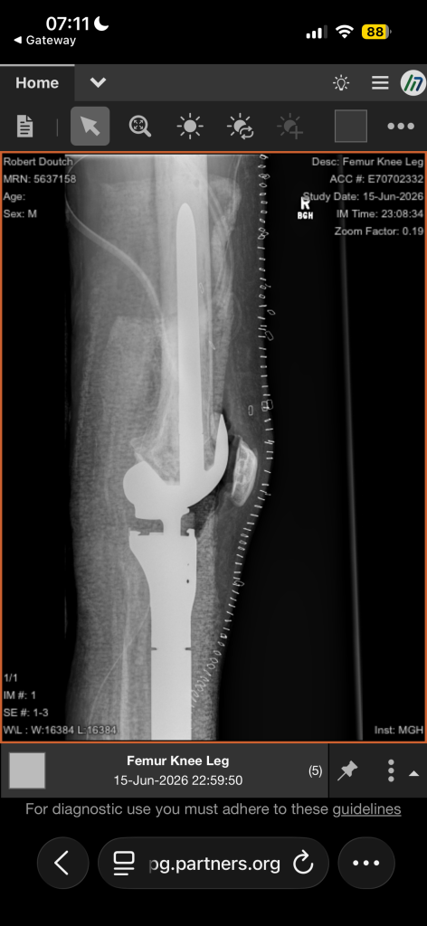
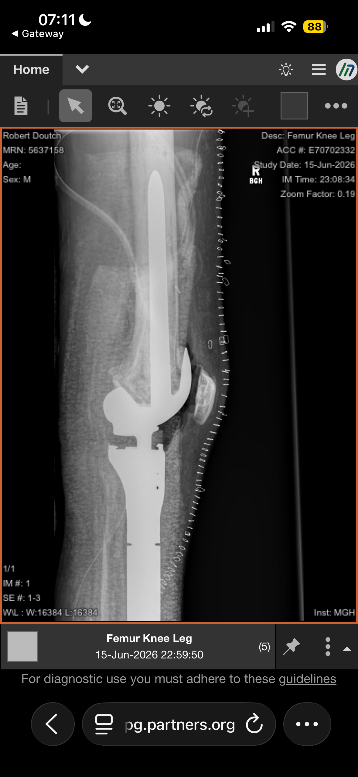
The second surgery on my right leg took place a week ago today. I was in the operating room for over 12 hours. Most of my right leg has been replaced.  The bottom 8 inches or so of my femur is new, connected to a new artificial knee, connected in turn to a new tibia that connects to the few remaining inches of the old tibia. Given that my right hip is already artificial you’d think that would come with superpowers, but so far nothing. I was in a lot of pain, I mean a lot, for the first two days. Then with all the pain medications I started hallucinating but I’m on the mend now. Just  finished up a session of PT, and hopefully later this week they’ll be able to discharge me to an acute care rehab closer to home.